Have you ever walked down the aisle of a bookstore or library and had a book immediately catch your eye? Maybe you homed in on an intricate design or an interesting title, but what was more likely, is that it was the color of the book cover that struck you the most!
While your parents may have told you not to judge a book by its cover, this life lesson doesn’t necessarily apply when referring to book covers.
Book covers are an important characteristic of what attracts potential readers to an author’s novel. Picking the right color for a novel goes beyond just surface level; there is a psychological component to why people are attracted to certain colors and the influence colors can have on humans. This is called Color psychology, or the study of colors and hues as a determinant of human behavior.
According to CCICOLOR – Institute for Color Research, “Research reveals people make a subconscious judgment about a person, environment, or product within 90 seconds of initial viewing and that between 62% and 90% of that assessment is based on color alone.”
From a marketing perspective, this make sense, but what about a psychological perspective? Color theory is not just for fashion designers – there is an entire psychology behind how particular colors can evoke certain emotions.
Think of red – this color can stir up a lot of different feelings: romance, passion, danger, envy, or even warning. Therefore, this color is typically used in book covers for genres like romance, thrillers, action, and mystery/ crime.
In contrast, the color blue can elicit feelings of calm, trust, or tranquility. Because of this, blue is a common color chosen for book covers in non-fiction genres. This includes memoirs, self-help, biographies, and some business or productivity books.
When walking through a library or a bookstore, particularly through the children’s book section, have you ever noticed that a lot of the book covers are yellow? That is because this color represents happiness, warmth, and energy; all things that can appeal to a young child. Additionally, children’s book covers might showcase hues of orange, pink, or a variety of brighter colors. This is intentional! Brighter, multicolor are eye-catching and can stimulate creativity.
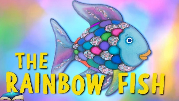
Think back on your favorite childhood book. You might remember the imaginative way it portrayed a moral lesson, but you probably also remember the way the cover looked. I remember being mesmerized by the book The Rainbow Fish from an early age. The content of the story still warms my heart, but as a child, what drew me most to the book was the shimmering scales of the book’s front cover.
Whatever the story is about, it is important that a book cover represents the overall tone the story conveys.
The list of colors and their influence could go on forever! Green tends to represent growth or harmony and can be seen in environmental or fantasy novels. Purple can represent luxury or mystery and can be used a lot for spiritual or creative novels, and black can often represent power and sophistication. Novels with black covers tend to fall into the thriller genres – think Stephen King!
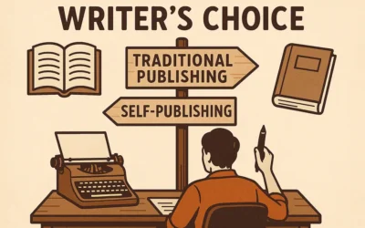
Overall, there is no one color that sells better than others because choosing a book cover color is dependent on the genre and the overall tone of a story. While choosing the right color for a book cover is important for authors, there are also some things that are good to avoid when creating a book cover.
A few of these include the following:
- Ignoring genre standards. While authors may want their novel to stand out amongst other book covers in the same genre, it is important that the book cover doesn’t go against what is conventional for that field. Say, if an author wrote a documentary style on murder where the tone is overall somber and serious, it would be odd if they chose a bright color such as pink or fuchsia. This would not only be confusing for a potential reader, but it would also lead them to think that the content of the book might be about something else entirely.
- Creating a book cover is to use too many colors. While this can be a shocking presentation and might persuade some readers to initially pick up a book, it could also be overwhelming and water down the overall impact of a books cover. It is important that authors think about what type of emotion they want to translate when choosing specific colors for their book cover!
A good way to see what might work as a good book cover is to visit your local library or bookstore and visit the section where your genre is located. Pick up some book covers that you are attracted to and study them! What made you pick up this book in the first place? Does this book cover evoke a certain emotion within you? These are all important elements to think about when creating a book cover that represents the story you want to share.
Ultimately, book covers impact more than just the visual eye. While having a visually pleasing book cover is significant, it’s vital to understand the psychological impact that a book cover can have on a reader as well. If you’re in the mood for something light, you might be drawn to book covers in a store or the library that are in lighter shades. If you are in the mood for something more serious, your eyes might be drawn to book covers that portray darker hues. Whatever the mood, there are plenty of books to choose from, and even more interesting book covers to match!
By Emma Dahlsten
Emma is an Editorial Assistant at Technica Editorial